Case Study
Solo
A brand development and ecommerce project. We helped sharpen Solo's identity, rebuild the storefront, develop and source products, and shape the marketing and content direction so the business could show up as clearly as its own point of view.
The Client
A brand with a clear point of view and products that needed to match it.
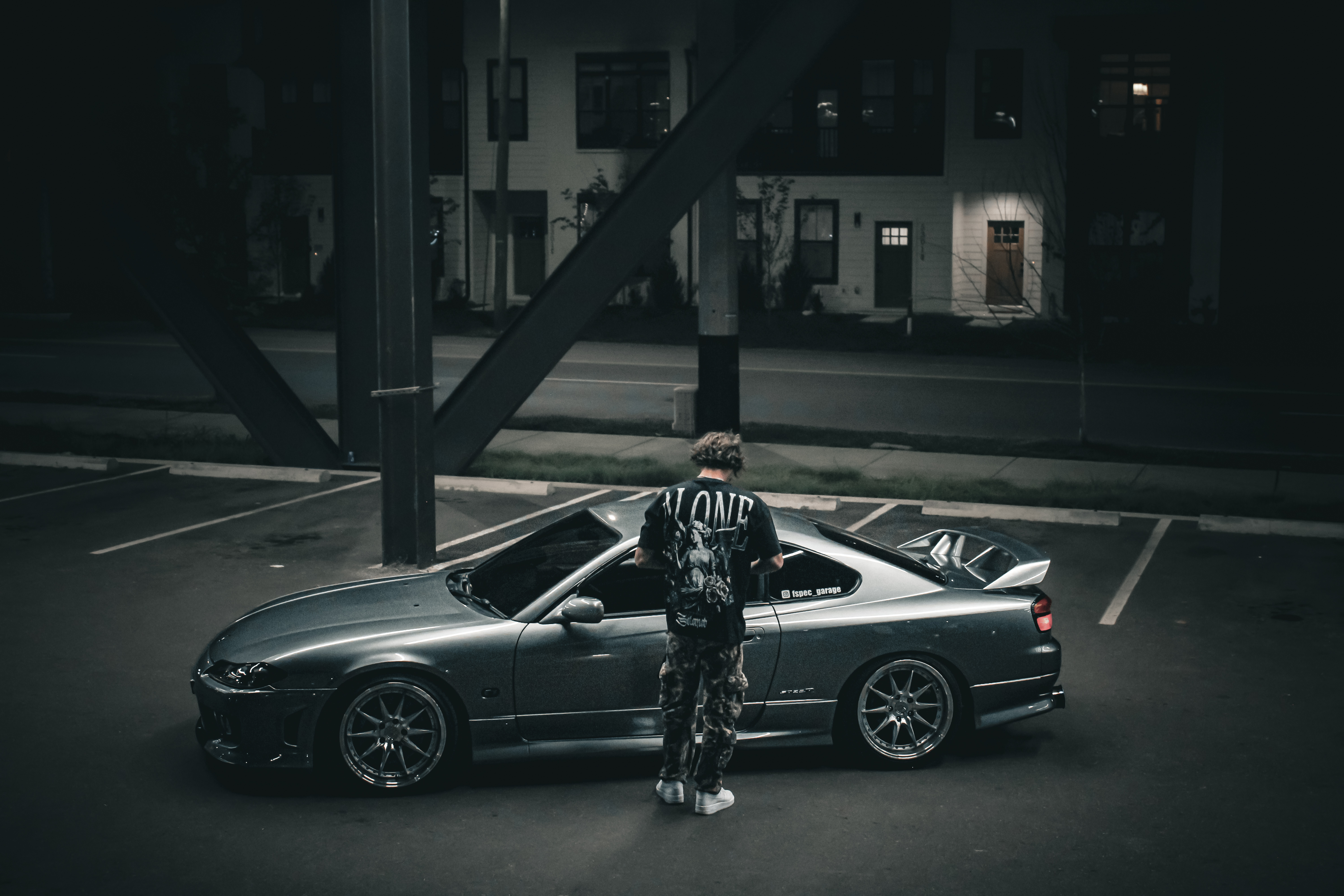
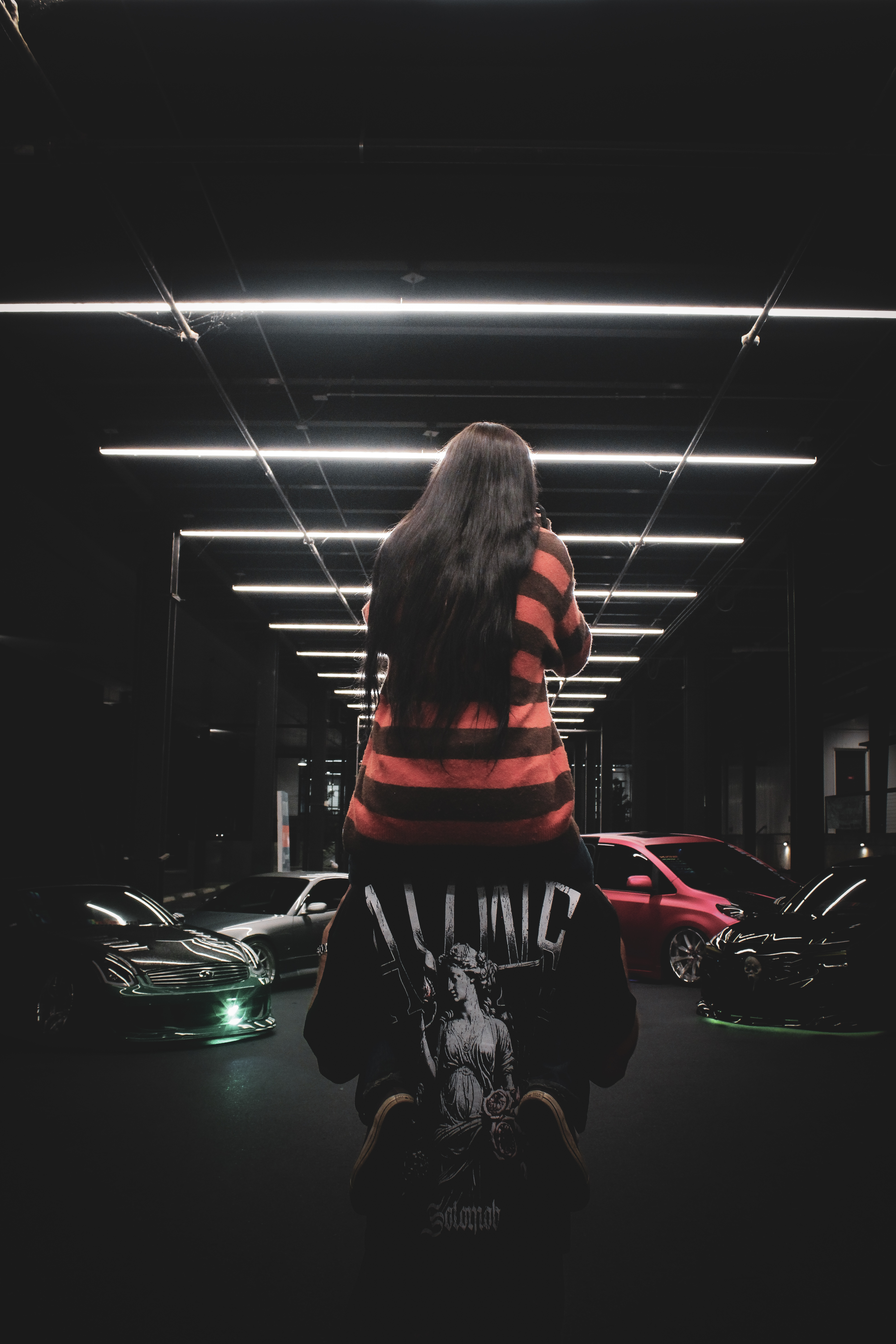
Solo is a streetwear and lifestyle brand built around one idea: stand apart. The identity runs on directness. Why fit in when you can stand out. Alone over fake. Success is quieter when you build it alone. These are not marketing lines. They are the conviction the brand operates from, and they attract a specific kind of customer. People who are building something on their own terms and want what they wear and carry to reflect that.
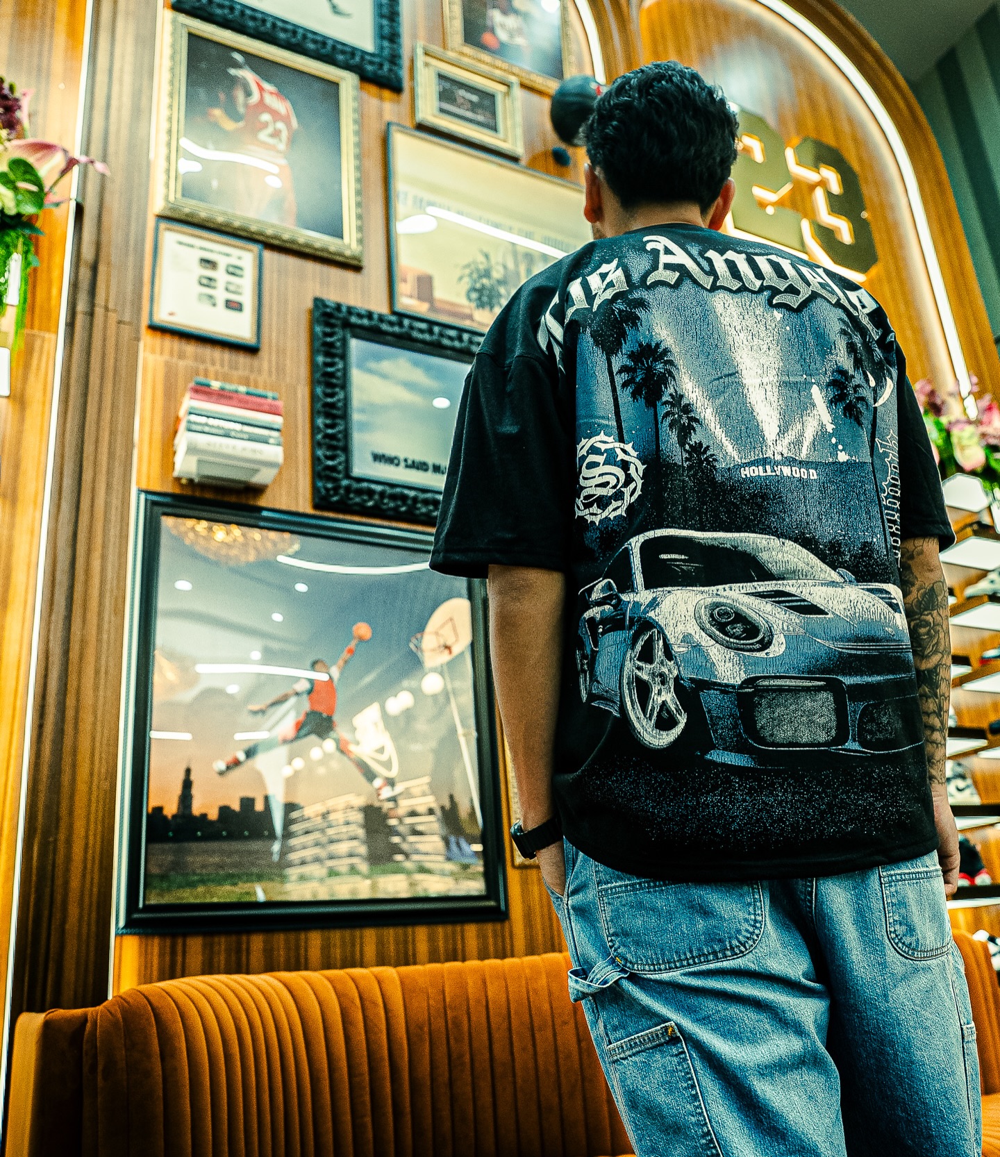
The product range reflects that same attitude. Apparel, headwear, decals, accessories, and lifestyle pieces that extend the brand beyond just clothing. Solo had a real following, a clear voice, and a growing product catalog. What it needed was a structure that made all of it feel as deliberate as the identity behind it.
The Problem
The identity was there. The presentation was not holding up to it.
Solo had a point of view strong enough to stand on. The products existed. The audience was paying attention. But the online presence was not carrying any of that with the same clarity. The site functioned as a product listing rather than a brand experience. Collections were not framed in a way that reinforced what Solo stands for. The product mix was growing without a clear framework connecting each piece back to the larger identity.
For a brand where the identity is the product as much as the product itself, that gap mattered. Someone discovering Solo for the first time should feel the brand before they read a word. That was not happening consistently, and it was costing the business credibility it had already earned.
Direction
Brand, product, storefront, and marketing rebuilt as one connected thing.
The work covered multiple areas at once. Brand direction to sharpen how Solo presents itself. Ecommerce redesign to rebuild the storefront into a brand experience rather than a catalog. Product development and sourcing to make sure what the brand was bringing to market felt aligned with the identity rather than disconnected from it. Marketing direction and content to turn the site into a tool that could actively support how Solo grows.
None of these were treated as separate projects. The goal was to make Solo feel more complete and more intentional from every angle at once, so the business could present itself with the same conviction it already had in its own messaging.
Why fit in when you can stand out.
Solo's identity was already clear. The work was about making the platform match the conviction behind it.
Web Design
A storefront built around the brand, not just the products.
The redesign rebuilt the customer experience from how someone first encounters Solo to how they move through collections, discover products, and take action. Categories were organized to reflect the full product range: apparel, headwear, decals, accessories, and all products. Collection-based merchandising replaced the flat product listing so each category could feel curated rather than simply stacked.
Promotional structure was rebuilt as part of the same work. Free shipping messaging, first purchase discounts, sale callouts, and best seller framing were woven into the experience so the site could function as a marketing tool rather than just a destination people arrive at and leave without acting. The result is a storefront that supports how Solo sells, not just what it sells.
Brand Direction
Defining how Solo should feel before anything else.
Brand direction was not about redesigning from scratch. It was about sharpening how Solo shows up so the identity came across more clearly and more consistently across every part of the customer experience. The messaging on the site, from collection pages to promotional blocks to the core brand statements, was shaped so everything was speaking from the same place.
The tone had a specific requirement. Bold, direct, confident, and independent. Getting that right made the difference between a site that looked like a streetwear store and a site that felt like a brand with something worth standing behind.
Product Development & Sourcing
Products shaped by the brand story, not just added to it.
A significant part of the project was supporting how Solo thought about and brought products to market. The goal was to move beyond releasing items without a clear connection to the larger direction of the brand. Products needed to feel like extensions of the identity rather than additions to a list.
Sourcing support helped carry that through on the operational side. The product range now visible on the site reflects a broader brand ecosystem: graphic apparel, headwear, decals, accessories, and automotive-inspired lifestyle pieces. Together they tell a story about what Solo stands for rather than simply presenting a set of options.
Marketing & Content
A site that works for the brand, not just a place to list what it sells.
The final layer of the work was helping Solo use the site as a tool for growth. A site that only shows products is a catalog. A site that frames those products within promotions, collections, seasonal pushes, and clear calls to action is a sales platform. The difference is in how the site is built and directed.
Content direction shaped how products were shown, how collections were framed, and how the brand identity carried through the full customer experience. The result is a site that uses product imagery, collection highlights, promotional blocks, and brand statements together to build desire and give customers a reason to act rather than just a reason to browse.
The Outcome
A brand that shows up the way it always should have.
Solo launched with a rebuilt storefront, a sharpened brand direction, a more intentional product mix, and a content and marketing structure that actively supports growth. The site now reflects the same conviction as the brand's own messaging rather than falling short of it.
Customers arriving at the site for the first time get the brand before they get the products. Collections have structure. Promotions have direction. The store functions as a sales platform rather than a catalog. The identity carries through consistently from the first page to the last step of purchase.
A storefront built for the brand
Collection-based merchandising, organized categories, and promotional structure that makes the site a sales tool rather than a product listing page.
A sharper brand presence
Cohesive direction across visual identity, messaging, and content so Solo feels more recognizable and more intentional at every point of contact with a customer.
Products that fit the story
A product range developed and sourced to feel like a natural extension of the brand rather than pieces added without direction or connection to the identity.
"Before this, the site was just where the products lived. Now it is where the brand lives. The difference shows in how the whole thing feels and how it represents what we are actually building."
Solo Premium Brand solotm.shop
Ready to get started?
Tell us about your project and we will tell you how we can help.